Polite & Friendly's
inMarley's Sig for Grim (finally)
J_MarleyFri Mar 19, 2010 2:34 am
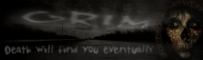
Okay, I actually had a little time to sit down and do something. This one is a bit darker than the last one I did for Grim.

Quote Post
BraxisFri Mar 19, 2010 2:53 am
oooh, dark and... solitary? i like.
Quote Post
J_MarleyFri Mar 19, 2010 2:57 am
Yeah, not as cheery as the last one, huh?
Quote Post
ImmolationFri Mar 19, 2010 3:57 am
Looks sweet marley! Very ghostly... One thing I noticed is that just to the right of the text, some grey smudge (or whatever you wanna call it) kinda overlaps on the grim reaper's face. I also think you could do something really cool with a border.
Quote Post
J_MarleyFri Mar 19, 2010 5:47 am
His face is translucent. I changed the opacity on him to try and make him fade a bit. The "smudge" is the background showing through the hood. And yeah, Braxis was saying that the sig seemed too square and suggested beveling the road a little. A border might work too but I am going to hold off on all changes until I can work on them all at once. Hoping Grim sees this soon.
Quote Post
GrimFri Mar 19, 2010 11:03 am
i like this one marley, i liked the first one also but for different reasons ,
i was a big fan of the grim fandango game, very funny game. by lucas arts infact iv still got my boxed copy on the shelf.
3 things would help
1. A border
2. A light edge to the Grim text
3. make the road stand out just a little more
Quote Post
i was a big fan of the grim fandango game, very funny game. by lucas arts infact iv still got my boxed copy on the shelf.
3 things would help
1. A border
2. A light edge to the Grim text
3. make the road stand out just a little more